Common Lighting Mistakes in Rental Apartments and How to Fix Them Without Wiring
Renters can't rewire anything, but dark corners, harsh overheads and badly placed switches are all fixable...

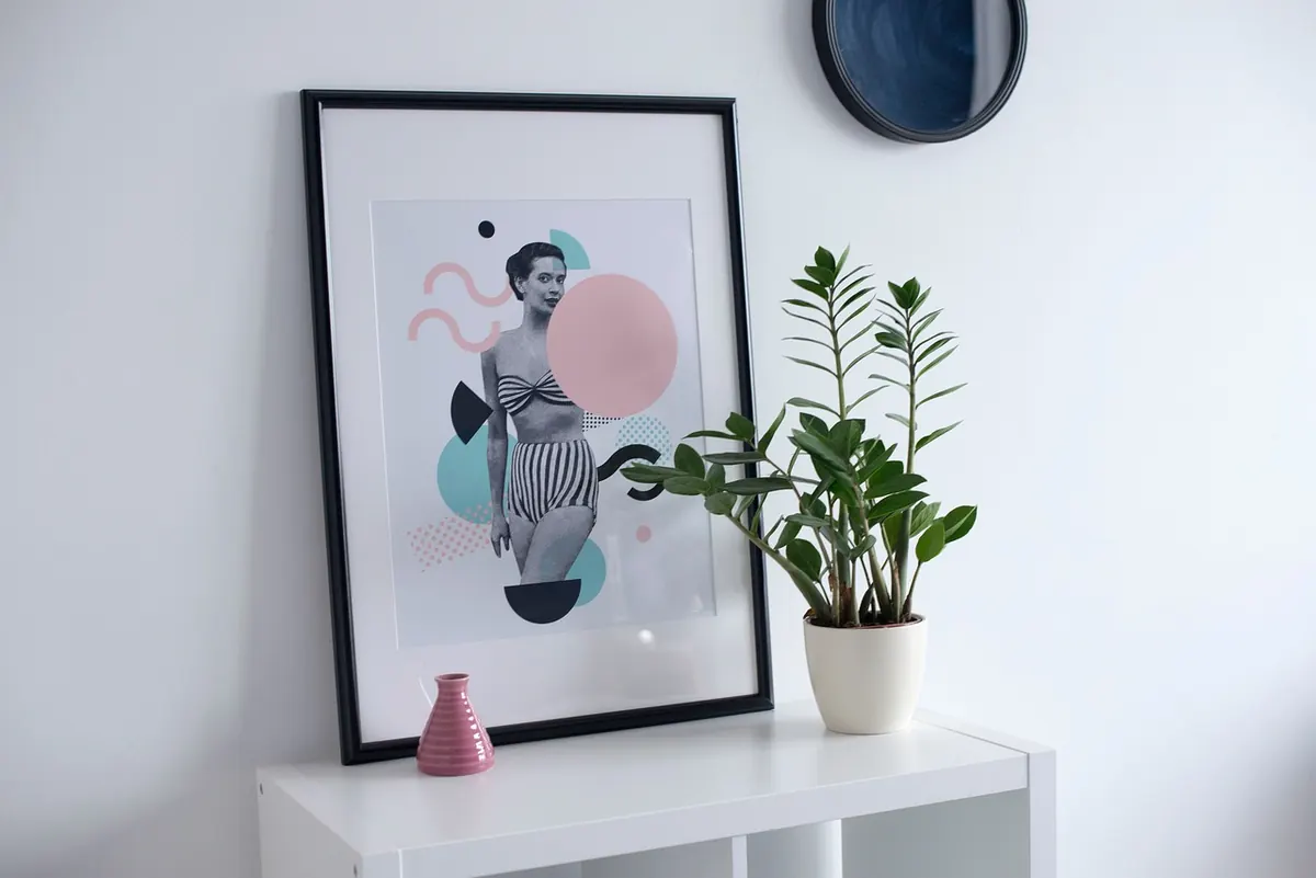
A gallery wall fails quietly. Nothing falls down, nothing looks broken — the arrangement just feels slightly off, and you can't quite say why. Usually the problem isn't your taste or your art. It's three numbers: height, spacing and scale. Get those right and even a mismatched collection of prints looks deliberate. Get them wrong and a beautiful set of frames looks like it was hung in a hurry. Here are the mistakes that show up most often, and the corrections that take minutes to apply.
Standing in front of a blank wall and tapping in a nail at the height that feels right is how most gallery walls end up too high. Your eye level is not the standard — museum height is, and that sits around 57 to 60 inches from the floor to the centre of the arrangement. That number works because it's comfortable for most adults standing in front of the art, not because it's a rule someone invented to be difficult.
The exception matters more than the rule: when a gallery wall hangs above furniture, the furniture sets the height. Aim for 6 to 10 inches of clear wall between the top of a sofa, console or headboard and the bottom edge of the lowest frame. Any lower and the art crowds the sofa; any higher and it floats, disconnected from everything below it.
To fix it, measure from the floor up and mark the centreline of the whole arrangement in painter's tape before you touch a nail. Then check where the bottom edge lands relative to your furniture.
Wide gaps are the single fastest way to make a gallery wall look accidental. Gaps of 2 to 3 inches between frames keep a group reading as one composition. Push past 5 or 6 inches and the eye stops seeing a gallery wall and starts seeing a scattering of unrelated pictures.
Consistency matters as much as the number. If one gap is 2 inches and the next is 5, the arrangement looks wobbly even when every frame is level. Pick a spacing — a paint stirrer cut to 3 inches makes a good reusable spacer — and use it everywhere.
Airy, spread-out layouts can work on a very large wall, but they need stronger discipline than tight ones. Keep the spacing uniform, align the outer edges of the group into a loose rectangle, and make sure the pieces are large enough to hold their ground. A loose layout with small frames on a big wall just looks unfinished.
Scale errors are the hardest to spot because nothing looks technically wrong. The frames are level, the spacing is even, and the wall still swallows the arrangement. A lone 8x10 print on a ten-foot wall has no chance; neither does a cluster of six small frames spread out to cover the same space.
Two measurements help. First, art hung above furniture should span roughly two-thirds to three-quarters of the furniture's width. Above an 84-inch sofa, that means 56 to 63 inches of art — a real constraint that usually means bigger pieces, not more small ones. Second, the whole arrangement should occupy a meaningful portion of the wall it sits on, not cling to the middle like a postage stamp.
The fix is rarely to spread things out. It's to add larger pieces, group the small ones more tightly, or move the whole arrangement to a wall where it has a job to do.
Nails are permanent. Paper is not. Lay the arrangement out on the floor first, stand on a chair and look down at it, and rearrange until it holds together. Then transfer it to the wall.
The photograph step sounds fussy and isn't. A phone screen flattens the arrangement and shows imbalances you stop noticing when you're standing two feet away.
A gallery wall with no hierarchy looks like a jigsaw puzzle. One piece should lead — larger, bolder, or simply placed near the centre of the composition — and the rest should support it. Framing helps here: keeping frames in a similar finish, or a consistent pair of finishes, gives a mixed collection a shared language. If your frames are wildly different, spacing them evenly and keeping one or two large pieces in the mix stops the wall from looking like a flea market stall.
Light switches, thermostats, vents, curtain rods and door swings all interrupt a layout, and they're easy to forget until the last frame is up. Walk the wall first and note every obstacle, then build your arrangement around them rather than through them. Leave a few inches of clear space below the ceiling, too, so the top row doesn't look squashed against it.
Nothing here requires starting over. If the group sits too high, lower the whole arrangement and fill the old holes with spackle and touch-up paint. If it's too spread out, shift the outer pieces inward and let the gaps tighten. If there's no anchor, swap your largest frame into the centre and move the smaller pieces to the edges. If the spacing is inconsistent, rehang one column at a time using a level and a spacer — a slow job, but faster than redoing the wall twice.
And if the whole thing looks small on the wall, don't stretch it. Add pieces, go bigger on the anchor, or move it above a piece of furniture where it finally has a reason to be there. Scale problems are solved with size, not space.
Photo: StockSnap / Pixabay
Renters can't rewire anything, but dark corners, harsh overheads and badly placed switches are all fixable...
Twelve space-saving furniture pieces that work twice as hard in a small apartment, plus the measurements...
A practical beginner's guide to floating shelves: picking the right bracket, locating studs, choosing...